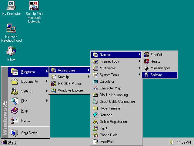
Windows 95 which turns 20 today changed the way we use our desktop computers foreverThe next 20 years
It featured significant improvements over its predecessor, Windows 3.1, most notably in the graphical user interface (GUI) and in its relatively simplified “plug-n-play” features. Bill Gates’s specified aim of one PC per person per desk in action was put in action by Microsoft 95. It brought to the scene 8MB of RAM, 15-inch CRT monitors and 320MB hard drive along with Internet for most of the home users. The concept of a ‘Start’ menu, which is a button well placed at the bottom-left corner of the screen was introduced by Windows 95. It was introduced as an additional means of launching applications or opening documents so that one could move through them easily using the Start menu as the central point. It also made it easy for the users to locate the most frequently used documents and applications due to its simplicity. Mostly all versions of Windows that followed later have retained this menu, except Windows 8, a change which had a huge backlash. However, in the earlier days, operating systems such as DOS and CP/M allowed the user to reciprocate using only typed text commands. The 1970s changed all this with Douglas Engelbart’s development of the computer mouse, Ivan Sutherland’s work with Sketchpad and the use of lightpens to control CRT displays, and the Xerox Parcresearch team’s creation of the Windows Icon Menu Pointer graphical interfaces paradigm (Wimp), which is the combination of window, icons and mouse pointer, that remains the same today as well. Apple in the early 1980s had developed graphical operating systems for its Lisa (released in 1983) and Macintosh (1984) computers, and Microsoft had released Windows (1985). The desktop, a comprehensible metaphor for a computer is the central point for all these interfaces to depend upon. It allows us to work with functions such as information in files, arranging them in folders, delete unwanted data to the recycle bin, and bookmark something that is of interest. Metaphors are useful, as they enable users to comprehend concepts faster; however, depend on the metaphor that is understandable to the user and handy for the programmer and designer putting it into effect without extending it beyond imagination. The benefit is that the functions (icons) used in the workplace is similar to those in the pictures making it easy to understand. However, the world has changed from the time Windows 95 was launched 20 years ago. Today, we have smartphones and smart TVs and we use the Internet practically for anything and everything. Touchscreens are now found almost everywhere replacing the traditional mouse-driven interface approach. The screen resolution these days are so high that it is practically impossible to see individual pixels. Even though things are changing, we still have Windows. Actually, they need to change. The desktop metaphor that has for long been the choice of households is regarded as a common and well known tool instead of a specially designed and computerized equipment. Do you think it is still suitable? Most of us sit in paper-less environment in offices today, phones and tablets are being used to read books instead of hard-copies. Many of them type their own letter and their own e-mails and discourage printing of emails. Further, files have become electronic instead of physical. Reference books have given way to internet search engine for finding of information. Also, granular search has replaced categorizing and organizing of data. Even though the mouse-driven interfaces now depend only on a single point of input, there is an increase in the touch-based interfaces that accept touches, swipes, and shakes in different combinations. The new rising metaphors are dual-finger scrolling and pinch-to-zoom, which are natural user interfaces (NUI) and not GUI.
The next 20 years
No one can foretell as to what would happen 20 years down the line; certainly there is one thing that interfaces in the coming years would be using more of human senses to control the computer and display information. Interfaces will become more intuitive and easy to perceive, also less dependent on items such as icons, arrows and boxes. Human gestures interfaces will be more commonly used and would be incorporated into technology though virtual reality and augmented reality throughout the world making it feel and look more natural. There are already some appropriate devices existing in that context, such as Geomagic’s Touch X (formerly the Sensible Phantom Desktop) that provides three-dimensional forces to make 3D objects feel solid or ShiverPad, that delivers shear forces on surfaces that provide a frictional feel to touch devices. Another promising technology is Airborne haptics that develop tactile interfaces in mid-air. Without the need to touch any physical device, the users can feel acoustic radiation fields that come out from devices through ultrasound. Videogame manufacturers which includes the Microsoft Kinect and Hololens have shown the way with these interfaces where it allows the users to use their eyes through head-mounted displays or body gestures to control the interface. Once communication with a computer or device can be influenced using movements of the body, natural gestures, or spoken commands, the indispensable need for the Windows-based metaphor of computer interaction begin to look their age. Resource : Tech Central.
