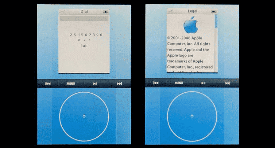
The experimental prototype was designed around an operating system called “Acorn OS”, which was the internal code name for the software and the device shows an acorn on the boot screen instead of an Apple logo.
“Apple clearly made the right choice,” pointed out Dickson when Apple chose to ditch those efforts and focus on developing the iPhone OS that eventually became what we know today as iOS. Acorn OS, featured an iPod Classic-like interface with a digital click wheel that could be used for navigating between menus. The screen of the prototype is split into two halves, with the bottom occupied by a software click wheel and the top by a menu-based UI (user interface) that’s a straight copy of the iPod’s. “Much like the first production iPhone, the prototype features numerous same features including an aluminium chassis, multi-touch compatible screen, 2G connectivity and Wi-Fi radios”, Dickson writes. On the menu are options such as “Favorites”, “Contacts”, “Dial”, “SMS”, “Music”, “Settings”, “Recents” and many other, and it’s navigated by circling around the click wheel to go up and down, with a center press confirming an action, just like on the iPod. You can check this out in the video below.
The device shows an acorn icon on booting. The interface does look rather odd and the click wheel does appear to be a waste of screen space. It is pretty evident that Apple too thought the same way and did not convert this device into a reality. Also, the video doesn’t show a browser option in the UI. Probably, it wasn’t ready at the time the prototype was designed. Apple’s 2006 patent application for such a device prior to the iOS implementation proves the prototype’s authenticity, writes Dickson. This means that the rumors of a click wheel iPhone prototype doing the rounds for years seem to confirm its existence.
